Rescover
own your universe
Rescover refurbishes old items for reuse, produces Permaculture-based food products and offers courses on sustainable living.
A’Design Award & Competition 2024 recognised this design as fully eligible to win the award.
Design Process
The adventure started with analysing the client’s answers to the brief questions. The company’s scope, mission, values, competitive advantages and future goals were reviewed. The research was done on the visual elements of nature and culture to visualise the concepts. The design emphasises simplicity for eco-friendliness. It needs minimum resources for physical implementation and minimum brain processes to remember. The audiences feel the love while they look at the brand’s visual identity and use refurbished furniture, eat organic vegetables and learn permaculture.
Logo Story
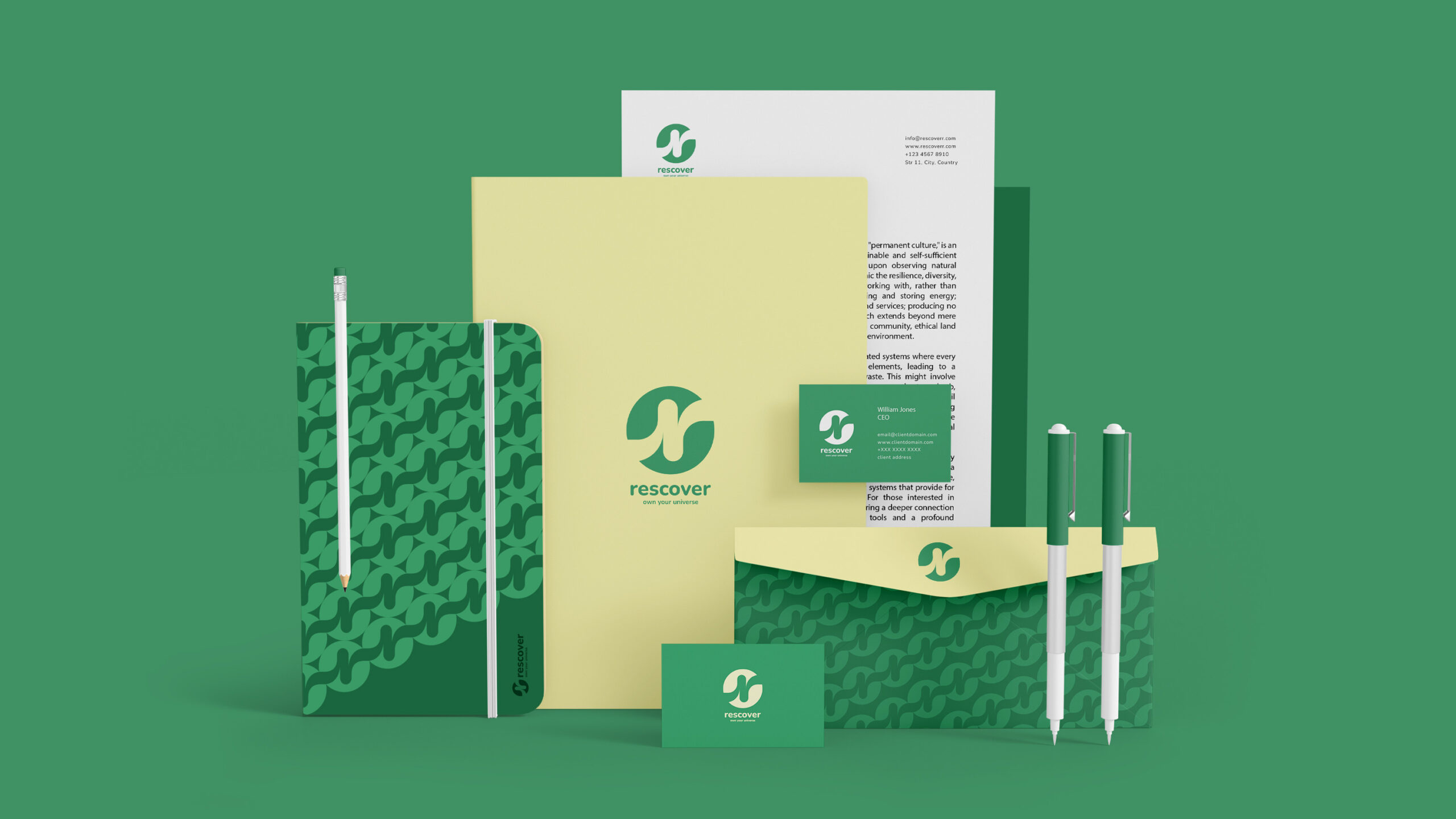
The Rescover company has a ”cycle” and the two Rs from the ”rescover” word represent the cycle. The refurbishing, recycling, reusing old items and growing food with permaculture are ”cycles” which is reflected by the name ”rescover” with two ”R”s at the beginning and the end of the word. One of the Rs is connected upside down to the other it showing people’s connection, and the green circle behind the Rs is the symbol of the environment and universe; the Rs are in front of the green circle, it’s like they embrace it and protect it.
Colours
- Green reflects almost all concepts of nature protection, it’s also the easiest colour to process for the brain so it uses the minimum mind energy.
- Yellow is related to awareness, education and happiness.


Working with Hani was an easy and smooth process. After completing a survey to give him an idea of what I was looking for, and what the company was about, he went away and started designing, keeping everything in mind to ensure that the logo was a true representation of what the company stood for. And once it was ready he presented his ideas, illustrating the reasons for his choice of colours as well as design. And I believe that this attention to detail shines through the final product.